Your cart is empty
Enable cookies to use the shopping cart
Loading...
$0.00
Loading...
Taxes and shipping calculated at checkout
The evolution of the Tralee Golf Club identity is a great example of a club moving from a traditional heraldic crest to a cleaner, more recognizable logo while preserving its heritage. The original crest (1980s through the 2000s) When the club opened its Arnold Palmer-designed course at Barrow in 1984, it continued using a traditional golf club crest that reflected both the club's history and its spectacular setting. The crest incorporated several key elements: Sailing ships representing Tralee Bay's long maritime history and the trading vessels that frequented the Kerry coast. Sand dunes reflecting the dramatic links landscape that defines the course. A Norman castle tower, echoing the 13th-century tower that overlooks the 3rd green and the area's medieval history. A rose, referencing the famous Rose of Tralee festival. Crossed golf clubs tying the imagery back to the game itself, much like the Royal Birkdale Crest. Rather than centering on a single image, the crest told the story of Tralee through multiple local symbols. The transition to the tall ship Over the last decade, Tralee gradually shifted away from using the full crest - which could be large and difficult to embroider on apparel - as its primary club logo. Instead, the club adopted a single tall ship silhouette as its principal logo on apparel, digital media, signage, and merchandise. The reasons are largely practical and branding-focused: The tall ship is the most distinctive element from the historic crest. It reproduces exceptionally well when embroidered on polos, hats, and outerwear. It creates an instantly recognizable mark without the visual complexity of a traditional heraldic shield. It aligns with the broader trend among premier golf clubs toward simpler, iconic brand marks while retaining historical meaning. Today Today, Tralee effectively uses two identities: The historic crest remains the club's ceremonial emblem, appearing on official documents, trophies, and some club materials and is available on apparel and merchandise only for club members. The tall ship has become the everyday face of the brand, especially on apparel, merchandise, social media, and visitor marketing. That approach mirrors what many prestigious golf clubs have done in recent years: preserve the traditional crest for heritage while adopting a simplified icon that is easier to recognize from across a clubhouse... or across an airport lounge when another golfer spots it.
With Royal Birkdale top of mind these past few weeks with The Open Championship, I thought I would take the chance to dig into the elements of its crest. We are huge fans of its recent refinement - it preserves the historical character of the original crest but is infinitely easier to use to decorate apparel and merchandise. The overall story Read from top to bottom, the logo says: Royal status↓The game of golf↓Regional and historic identity From a design perspective: green carries the golf reference red and gold convey warmth, tradition and ceremony blue balances the warmer colors white creates clarity in the clubs and bird black makes the emblem reproducible in embroidery and at small sizes The current version is a more modern and flattened crest that draws from and honors the original crest pand places it in a form that is easier reproduce accurately at a scale that makes sense on golf apparel. 1. The crown The crown is the clearest historical addition. Birkdale Golf Club received permission to use the “Royal” title in 1951, so the crown signals that royal designation. The crown gives the mark height and ceremony. Without it, the shield would feel like a civic badge; with it, the identity becomes unmistakably “Royal”. 2. The shield The shield is the crest’s structural backbone. Its shape borrows the visual language of British heraldry - history, institutional continuity and membership. It also works well on blazer pockets, flags, scorecards and embroidery. It is deliberately not minimalist, even with the recent refinement. The shield is divided into: one horizontal panel across the top two vertical panels below That arrangement creates a neat hierarchy: the sport first, then the place. 3. The crossed golf clubs The green upper panel contains two crossed golf clubs and a golf ball. This is the most literal section: the clubs identify the organization as a golf club the ball reinforces the sporting reference the crossed arrangement gives the clubs the dignity of heraldic weapons, rather like crossed swords translated into golfing language The green background naturally evokes turf and the golf course. 4. The white bird on blue The lower-left panel contains a white bird in flight on a blue field.It is commonly read as a stylized Liver bird, linking Birkdale to the wider Liverpool and Merseyside area. The Liver bird is one of the region’s most recognizable civic symbols. The bird’s upward, spreading form contributes several useful visual ideas: flight and freedom coastal air and open linksland movement, balancing the static rose opposite it 5. The red rose on gold The lower-right panel features the Red Rose of Lancaster, historically associated with Lancashire. Birkdale and Southport were traditionally part of Lancashire before the creation of Merseyside in 1974. The rose therefore anchors the club in its historic county identity. The Red Rose remains widely used as a symbol of Lancashire, including on neighboring Hillside Golf Club’s crest. This is arguably the most historically legible element in the shield: red rose: Lancashire gold field: provides strong contrast and heraldic richness five-petalled form: follows the conventional stylized heraldic rose rather than depicting a botanical flower The bird and rose together likely express Birkdale’s geographical position between the identities of Liverpool/Merseyside and historic Lancashire. We think it is one of the strongest in our club portfolio. Shop Royal Birkdale.
Glad to have had the time to sit down for the Hole Story podcast, where we told the story of F&D and how our unique e-commerce model is helping golf courses have a global merchandise solution. Take a listen!
Had the pleasure of sitting down with Top 100 Golf Courses, and talked about what makes a great logo, the differences in the US and UK golf markets, what makes Royal Birkdale such an enduring classic, and our favorite golf courses and logos. Take a look!
Sat down on the Grapes & Greens podcast for a conversation about the work we are doing to put forth our amazing clubs on a global scale in a way that honors them. Take a look!
This summer I had the chance to play golf in Ireland, Scotland, England, and Wales. As I played, I started to think about some of my favorite rounds and favorite memories of time on the courses that drove us to create F&D.
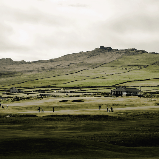
My first round in Ireland. My first true links. And the first club to say yes to Fescue & Dunes. Dingle is unforgettable—from the views of the Three Sisters to post-round pints at Foxy John’s.
You haven’t truly played golf until you’ve played where it began.
You never forget your first time on the links—mine began with hand-me-down clubs and a dream that led to Ireland. I’ve been chasing that feeling ever since.